Tailored tweaks for perfection
Request custom revisions at any time. We provide up to 5 minor revisions post-launch to keep things looking fresh.

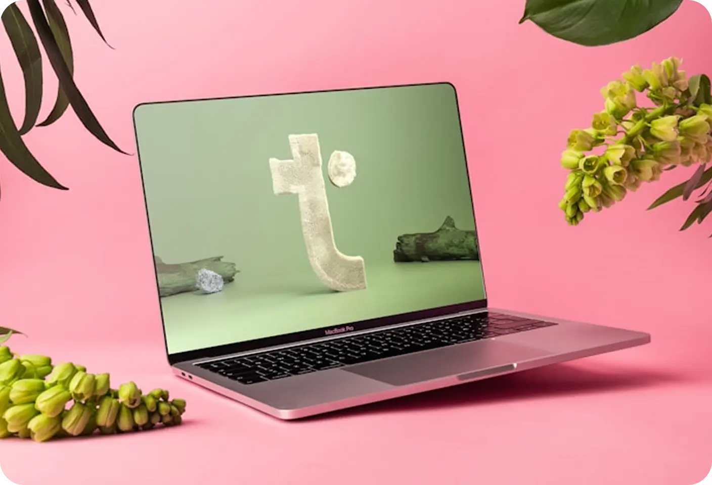
Nordic Tones had powerful features but users found the interface overwhelming and outdated. The navigation was clunky, the editing timeline wasn’t intuitive, and core tools were buried.
We created a modular layout system, simplifying how users access tools. The timeline view was redesigned for clarity. A fresh, dark-themed interface reduced strain during long sessions and gave Nordic Tones a premium feel.
We created a modular layout system, simplifying how users access tools. The timeline view was redesigned for clarity. A fresh, dark-themed interface reduced strain during long sessions and gave Nordic Tones a premium feel.
Increase in user session time
Reduction in bounce rate
Growth in new user registrations